
Coyote* is a landscaping company dedicated to transforming outdoor spaces into beautiful, functional, and sustainable environments.
(SCROLL)

(01)
PROJECT
OVERVIEW
PROJECT TYPE


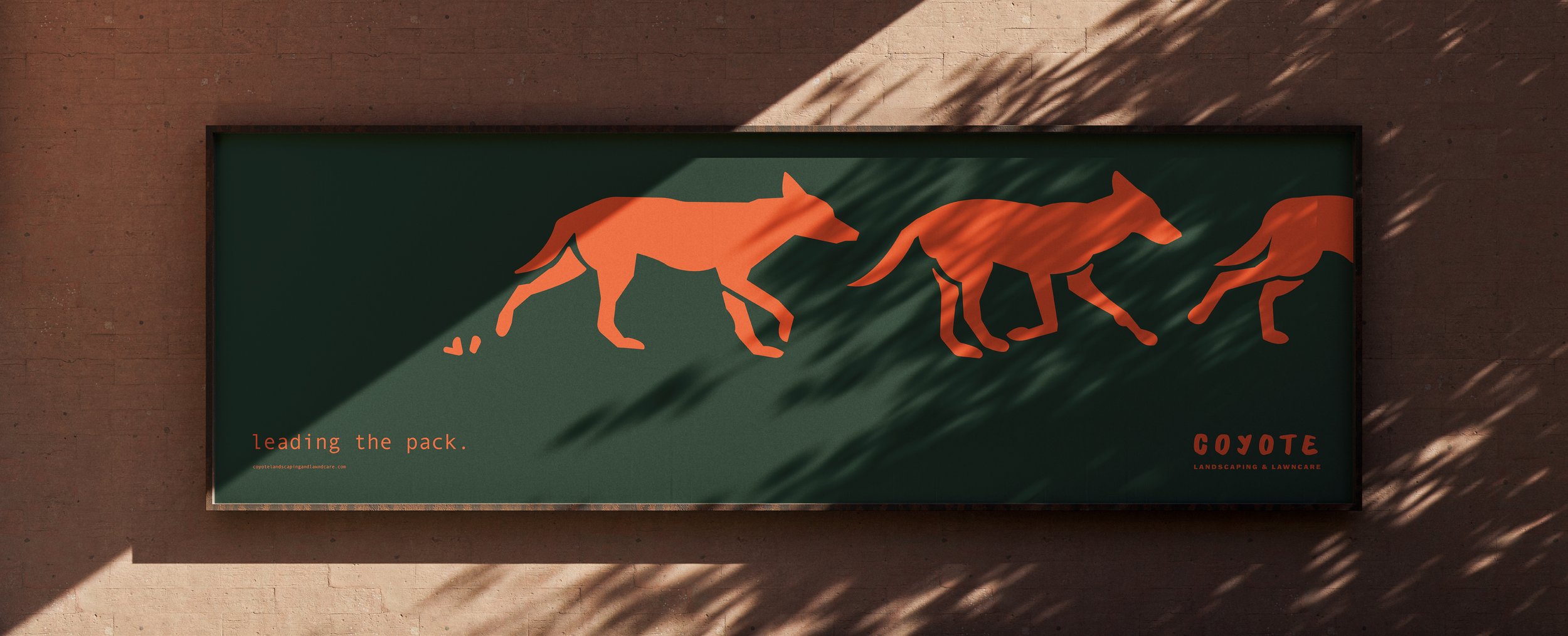
Coyote Landscaping and Lawncare* is a black owned business based in Indiana dedicated to providing comprehensive and expert landscaping and lawn care solutions. Their mission is to transform and maintain outdoor environments with skill, efficiency, and a commitment to exceeding client expectations, embodying the versatility and effectiveness of the coyote. With a sister location being built in Des Moines, Iowa, Coyote was looking for a new image to distinguish themself from their new set competitors.
With the new age of colorful and creative company brands in the midwest, Coyote networked to find a designer willing to help with this new identity. Key goals included a new logo, comprehensive branding, and new asset strategies to engage consumer engagement.
*one word. one voice. one earth.
(02)
REINVENTION
COLORS
ICONS
REBRAND
CATEGORY
SERVICES
LANDSCAPING
BRAND IDENTITY, LOGO CREATION, WEBSITE FRAMEWORK, PHOTOGRAPHY
BOLD, SAFE, ENGAGING, REMINISCENT
AFRICAN, INVITING, COLLECTIVE
COMMITMENT STATEMENT & EXAMPLES
Once visitors show interest by navigating further, the mission statement becomes crucial, explaining the "why" element in their brand identity.
SERVICES WITH GRAPHICS
Once comfortability is established, listing services seems like a no brainer. With a quick quality assurance statement and eye-catching African-inspired graphics, visitors are met with the staples of Coyote’s workload.
AFRICAN INSPIRED ICONS
CULTURE AND INCLUSIVITY
Finally, the visitor is enticed to reach the bottom of the page where they are met with Coyote’s final mission statement capitalizing on the core values of nature, community, and inclusivity.
SOME IMPACTFULL DEVELOPMENT IN AN OLD CITY
The concept of inclusivity served as the cornerstone in crafting this brand's identity. Recognizing the unique yet familiar landscape of this sister city, we aimed to weave a narrative of community that celebrated both its vibrant differences and its unifying commonalities. This ethos of "community through contrast" permeates every facet of the brand, from the diverse visual elements that represent African voices, to the overarching messaging that underscores shared experiences and aspirations. Our intention was to create a brand that not only resonates with the existing fabric of the city but also actively fosters a sense of belonging for all its inhabitants, highlighting the strength found in embracing the richness of human connection.


REFRESHING A RESPECTED BRAND INTO IT’S NEW CHAPTER
This landing page was strategically crafted not only to drive immediate conversions but also to significantly enhance brand recognition and foster a stronger connection with the target audience. It's designed to leave a lasting positive impression, reinforcing brand values and encouraging long-term engagement.
(03)
A NEW HOME
WEBSITE
NEW FRAMEWORK, DETAIL-ORIENTED NAVIGATION, ENGAGING
FALLING FAR AND LANDING A LITTLE CLOSER TO HOME
In revitalizing the website, our approach centered on creating a dynamic and intuitive user experience through a meticulously crafted scrolling framework. This new structure allows for a seamless journey through the brand's narrative. Mindful of the sister city's rich cultural tapestry, we delicately integrated African design elements – subtle patterns, earthy color palettes, and organic textures – to subtly nod to this heritage. However, our guiding principle remained rooted in the clean lines, spacious layouts, and accessible typography characteristic of Midwestern design. This thoughtful fusion aimed to create a digital space that felt both globally aware and locally grounded, offering a welcoming and familiar experience to its users while subtly celebrating a broader cultural connection.
LANDING PAGE


